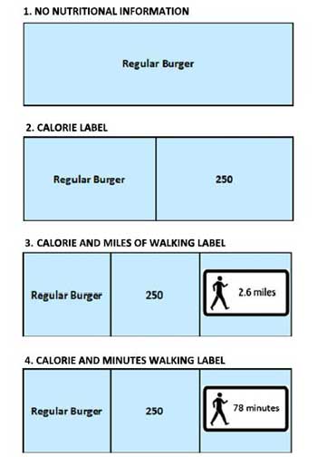
This archived New York campaign used activity comparisons to explain calorie content. The comparisons were campaign illustrations, not precise exercise estimates for every person. What caught our attention was the communication: the design! The execution!
The archived campaign featured posters using a three-mile walking route to illustrate the calories in a 20-ounce soda – from Union Square in Manhattan to Brooklyn – In the NYC Subway System.
We love this change, as the focus on what’s in our food becomes more clear, eating healthy is also easier when the facts are presented to everyone.
Read the full article here: Scientific American’s report on activity-based calorie labels