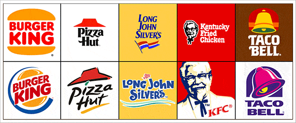
Some logo design trends are easier to spot when you see the outgoing and incoming marks in the same week. In Southern California, we’d grown used to the refreshed logos at many fast-food chains. On a trip to visit family on the East Coast, we saw plenty of older versions still on display. The brighter colors stood out, but so did the slant: the newer marks looked like they were moving.
What fast-food logo design trends get right
Fast-food branding has good reason to suggest speed. A leaning wordmark, more energetic artwork or a diagonal edge can give a still image a sense of direction. Brighter colors can make the change more obvious, especially when you remember a quieter version of the same logo. You don’t need animation to make a sign feel like it’s going somewhere.
The change is especially visible when you see the same chain with different signs in different places. If you’re planning a refresh, look at your own mark beside the proposed version, where both will actually be used. A slant that looks slight on a laptop can look much more pronounced across a storefront.
Decide what kind of movement fits
Not all logo design trends fit every business. A counter-service lunch spot that needs to signal a quick stop might benefit from a forward lean. A neighborhood bakery that wants people to linger might use a curved line to draw the eye without making the shop feel hurried. The question is what you want a customer to expect before they walk in.
Write that expectation in one plain sentence before sketching. For example: “We want someone passing on a bike to know this is a repair shop they can drop into.” Our brand identity and logo design work starts with what the mark needs to communicate, not with how many effects it can carry.
Change one thing at a time
Keep a level version for comparison
To see which logo design trends actually help, set your current logo beside a version with a modest angle. Keep the color the same. Try a separate version with a stronger color but no tilt. If you change the type, color and angle all at once, you can’t tell which change made the wordmark easier to spot or which made it harder to read.
Check the lettering separately from the symbol. You may get enough motion from one diagonal stroke in the mark and be able to leave the business name level. If you’re choosing type for the site that will sit beside the mark, our article on Google Web Fonts is a separate starting point for that decision.
Test the mark where customers see it
Logo design trends can look convincing on a presentation slide. Print the actual artwork at a size you plan to use and put it on the surface it’s meant for. Check it where the customer will see it, not from the distance where you’re used to editing it.
- On a sign: Step back and see whether the name can be read without stopping to study the artwork.
- On a phone: Put the mark in a small profile circle and check whether the crop cuts off a letter or an important shape.
- In one color: Print it in black on a receipt or label and check whether the angled detail still reads without a contrasting color.
Ask someone who hasn’t seen the sketches what they read first. Our look at Ford’s customer-led branding example offers another way to think about what your audience notices and values, apart from what your team intended.
Plan what changes and what stays
Logo design trends come and go. If your customers already know a particular shape or color, keep it unless you have a clear reason to replace it. Decide which items must change together, such as the front door sign and the website header, and which can wait until you reorder. A temporary mix of logos is easier to manage if everyone has the same file for new work.
Use logo design trends to generate options, not to pick a winner. This week, try one angled version and one level version on the smallest label or screen you use. If the angled version expresses the right kind of movement and the name is still easy to read, you have a reason to keep it.