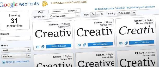
Google Web Fonts gives a small business more choice about how its site looks without having to draw type from scratch. The harder decision is what to use. Start with a face customers can read comfortably on a phone, then check that it fits your brand and doesn’t make them wait for the page to settle.
How Google Web Fonts widened the choice
As CSS and other tools for building websites improved, typography was still limited by what people had installed on their computers. Designers could count on roughly half a dozen familiar choices. The CSS rule @font-face changed that: a supported browser can download the font from a server and render it even when the visitor doesn’t have it installed.
Google’s web font API made serving those files easier. Its live preview let designers try type before choosing from a large library of free fonts. We’ve used Google Web Fonts since it launched, and we still recommend it as a starting point. Choose the font for the words customers need to read, not just how it looks in the preview.
Choose a family for the content you have
Try real copy from your site in Google Web Fonts. For a Denver café, that could be a menu item with a price and a short note about ingredients. For a contractor, try a long service name, a phone number and a button label. See whether numbers and punctuation stay clear and whether the same font can handle a short button and a paragraph without changing the tone.
Use weight before adding a second family
Try one family in regular and bold before choosing a separate headline face. A strong difference between those weights may give the page enough structure. When the website needs to match packaging or signage, bring those examples into the conversation with your graphic design team. A brand font that looks good on a large sign may work better as an accent than as the default for paragraphs or form labels.
Check the license and choose how to serve it
Some web fonts are open source and others need a paid web license. A desktop download doesn’t necessarily give you the right to serve the same file to every visitor. Check the terms for the specific family and version you plan to use. Even with Google Web Fonts, keep a note of where you got the font and what its license allows, especially if you intend to use it in print as well.
Ask your developer whether to serve the files from your own site or use a font provider. Either way, agree on a fallback that stays readable when the custom font doesn’t load. Request only the weights and styles you use, and make sure the files cover the characters your content needs.
Preview the page, not just the font
Readable type depends on spacing and available width, not just your choice of family. Test a long heading, a short paragraph and a form label on a narrow screen. Then repeat the test with larger text. A website design project is a chance to make those checks part of template approval rather than fixing each page separately. If you’re updating an established site, include typography checks in your redesign and launch plan.
Preview the page on a slower connection, too. Watch what happens before the font arrives. If a button moves or a heading gains an extra line, ask your developer to review the fallback. If staff will be changing content from a tablet, test the full website editing workflow with a realistic update.
Compare web font resources on a real page
Other providers offer web fonts too. Confirm current availability and licensing before planning around any of them.
- Google Web Fonts
- Adobe Fonts (formerly Typekit)
- Kernest
- Typotheque
- FontDeck
- Fonts.com
Start with one page that gets used, such as your main service page. Compare two families using the same words and screen sizes. Pick the one that lets a reader get through the page and find the next step without having to think about the type.